Case Study - Incorporeal
Solving Gameplay Problems Through Visual Design
Overview
Game mechanics alone do not create a great player experience. Players must first understand the game before they can master it.
During the development of Incorporeal, I found that many gameplay issues were not caused by the mechanics themselves, but by how information was communicated to the player. Instead of redesigning the gameplay, I explored how visual language, including UI, lighting, color, composition, and environmental cues, could improve readability while preserving the original design intent.
This case study documents that design process and explains how visual design became a tool for solving gameplay problems.
Core UX Problem
Players can separate their spirit from their body, allowing each form to serve a different gameplay purpose.
- Body Mode - Dodge attacks and interact with the environment.
- Spirit Mode - Engage enemies and deal damage.
Whenever players switch to Spirit Mode, the camera follows the spirit, while the physical body remains behind in the world.
As a result, both entities must remain meaningful to the player at the same time.
Unlike traditional action games, players are required to monitor two separate points of interest simultaneously, significantly increasing cognitive load during combat.
This created the project's core UX challenge:
Helping players manage their attention rather than overwhelming it.
Design Observations
Playtesting revealed three recurring usability issues. Although they appeared to be separate problems, they all originated from the same underlying cause.
01. Losing Track of the Body
As the camera followed the spirit farther away, players frequently lost awareness of where their physical body was located.
▪︎ Design Objective
Shift the challenge from searching for the body to managing player attention.
02. Difficulty Identifying the Player
During combat, players occasionally confused their own spirit with enemies, especially when multiple characters occupied the screen.
▪︎ Design Objective
Ensure the player's character always has the highest visual priority, regardless of gameplay state.
03. Poor Enemy Readability
Fast moving enemies often failed to attract enough visual attention before attacking.
▪︎ Design Objective
Allow enemies to be recognized proactively rather than relying on players to discover them.
Design Insight
Although these issues appeared different, they all shared the same root cause:
Player attention was not being guided effectively.
Rather than redesigning the gameplay systems, I focused on improving how visual information was prioritized. The following sections demonstrate how adjustments to visual language, UI, lighting, color hierarchy, and environmental cues helped players process gameplay information more naturally.
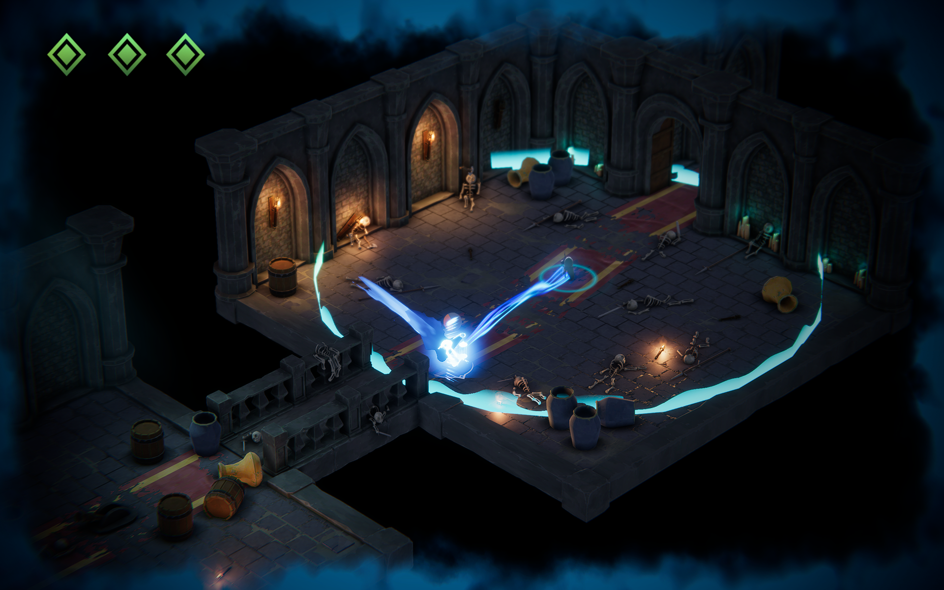
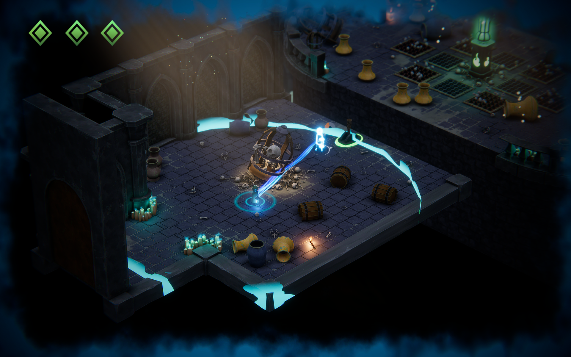
Attention Guidance
Body Pulse
A subtle pulse effect is emitted from the body while
the player is controlling the spirit.
the player is controlling the spirit.
This creates a passive reminder without distracting
the player from combat.
the player from combat.
Energy Radius
The spirit's movement range is visualized by a glowing
boundary surrounding the body.
boundary surrounding the body.
Instead of searching for the body, players only need
to remain aware of the playable area.
to remain aware of the playable area.
Spirit Trail
A blue trail follows the spirit during movement.
When players lose orientation, the trail immediately
reveals the direction back to the body.
reveals the direction back to the body.
Spirit Link
A dynamic light connection continuously links the
body and the spirit.
body and the spirit.
This acts as the strongest spatial cue whenever
the player quickly scans the screen.
the player quickly scans the screen.
Visual Readability
Problem 01
Players couldn't immediately recognize their current state.
The body and spirit needed distinct visual languages, and switching between them had to feel instantly recognizable.
To solve this, the lantern became the primary state indicator.
Body Mode -
The lantern burns with a warm orange flame, naturally attracting the player's attention.
Spirit Mode -
The lantern extinguishes while the spirit emits a blue glow. Additional energy effects appear around the screen to reinforce the active state.
This creates a simple visual rule:
The glowing object is always the character under the player's control.
Players understand the current state without relying on UI or tutorial text.
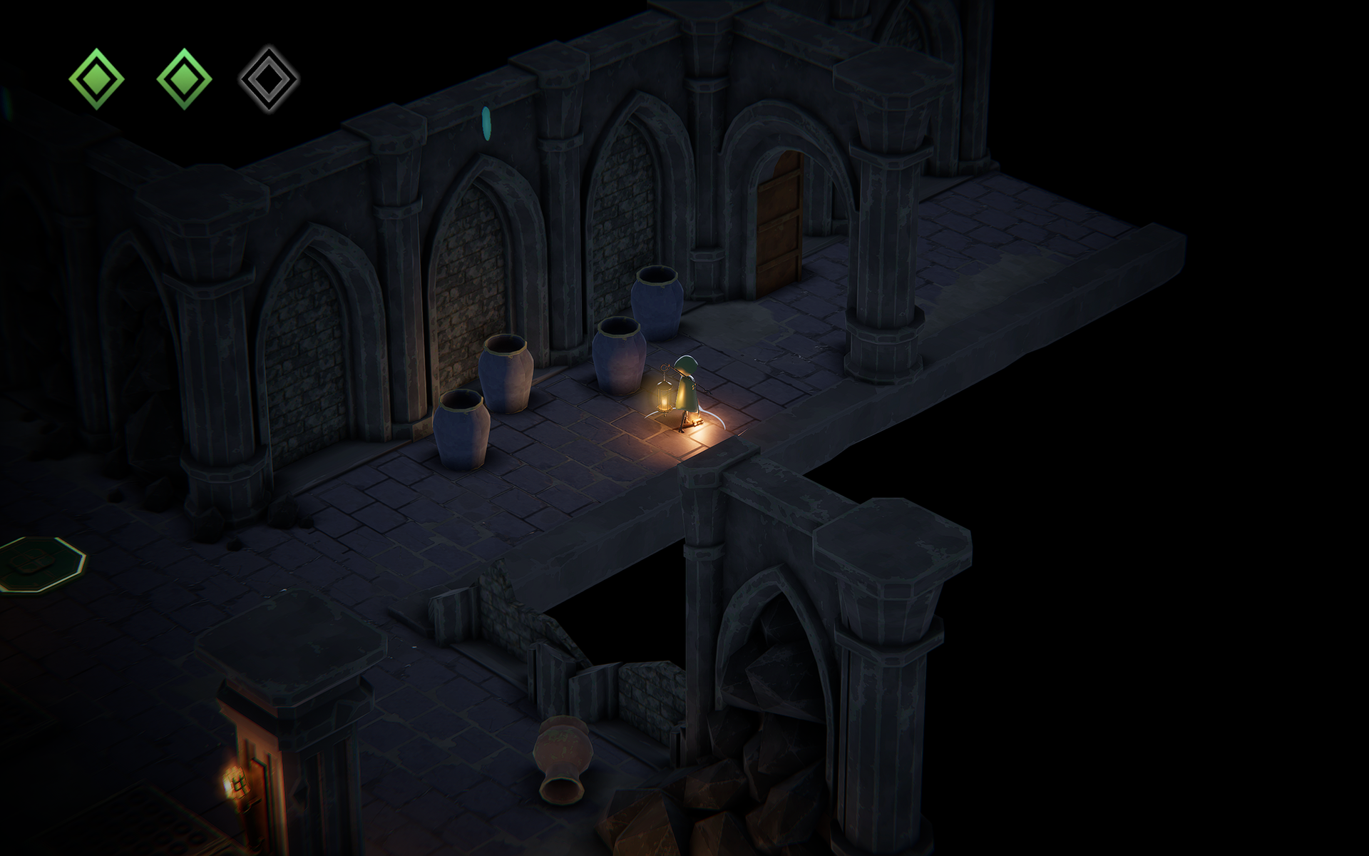
Problem 02
Players couldn't quickly locate themselves during combat.
Early prototypes relied on standard nighttime lighting, making the player difficult to distinguish from the environment.
To improve readability, I rebuilt the lighting hierarchy by removing ambient illumination, increasing local contrast, and adding a subtle vignette around the camera.
The lantern became the strongest visual focal point, allowing players to identify their position at a glance even during combat.
Visual Language
Building a Rule Based Visual System
Rather than explaining mechanics through tutorials, I designed a visual language that allowed players to understand gameplay intuitively.
Every interactive gameplay element follows a consistent color rule. Once players learn that green represents interactable gameplay objects, they can naturally predict the result of an interaction without reading additional instructions.
This shared language is applied consistently across multiple gameplay systems.
Consistent Visual Rules
Instead of assigning a unique color to every mechanic, a single visual rule is reused throughout the game.
▪︎ Enemies communicate danger.
▪︎ Shrine Flames indicate conditional triggers.
▪︎ Floor Switches represent puzzle interactions.
By reusing the same visual language, players transfer knowledge from one mechanic to another instead of learning each system independently.
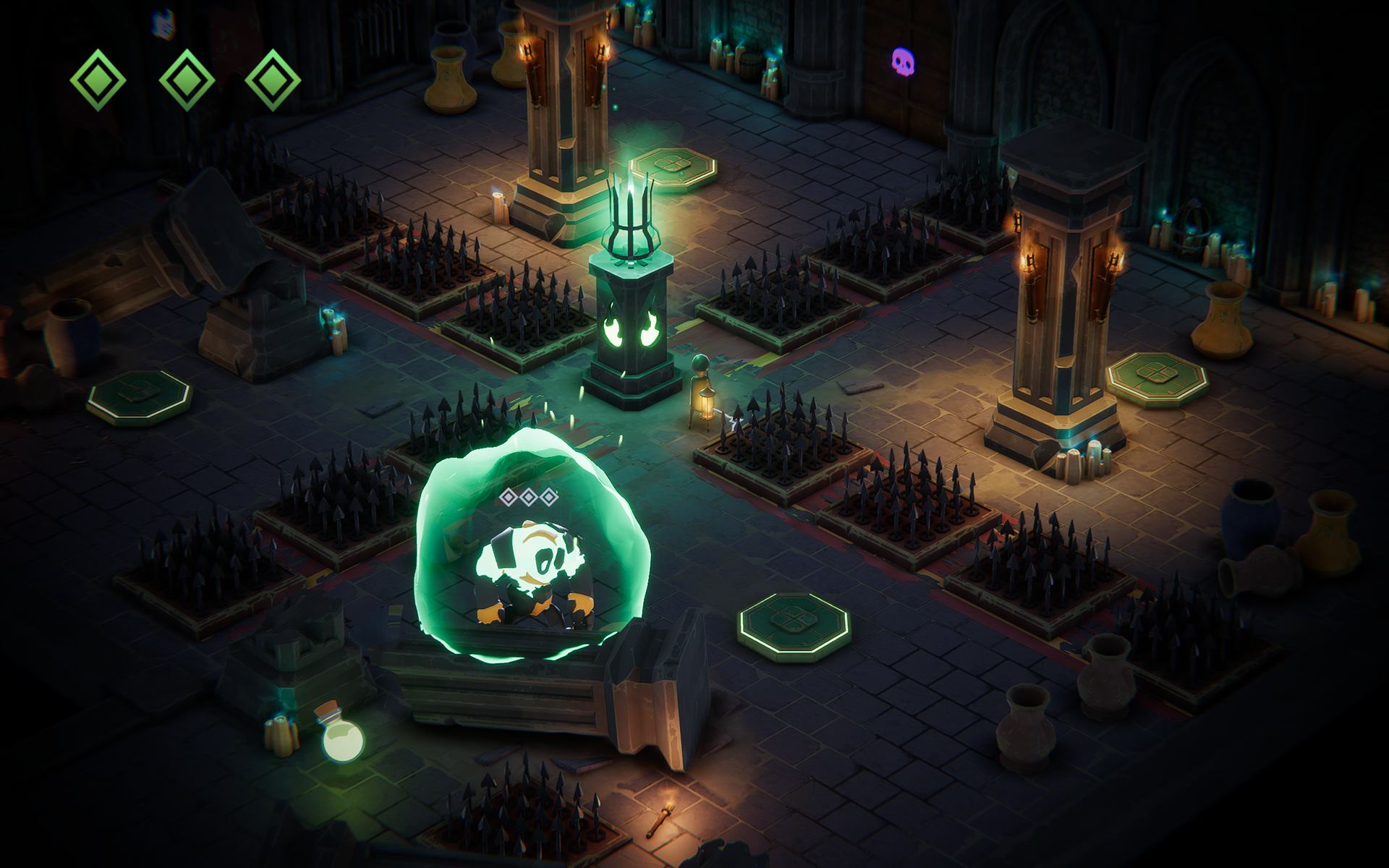
Green is consistently used to represent interactive gameplay elements across different systems
Design Principle
Readability Over Realism
Environmental realism was intentionally sacrificed whenever it conflicted with gameplay readability.
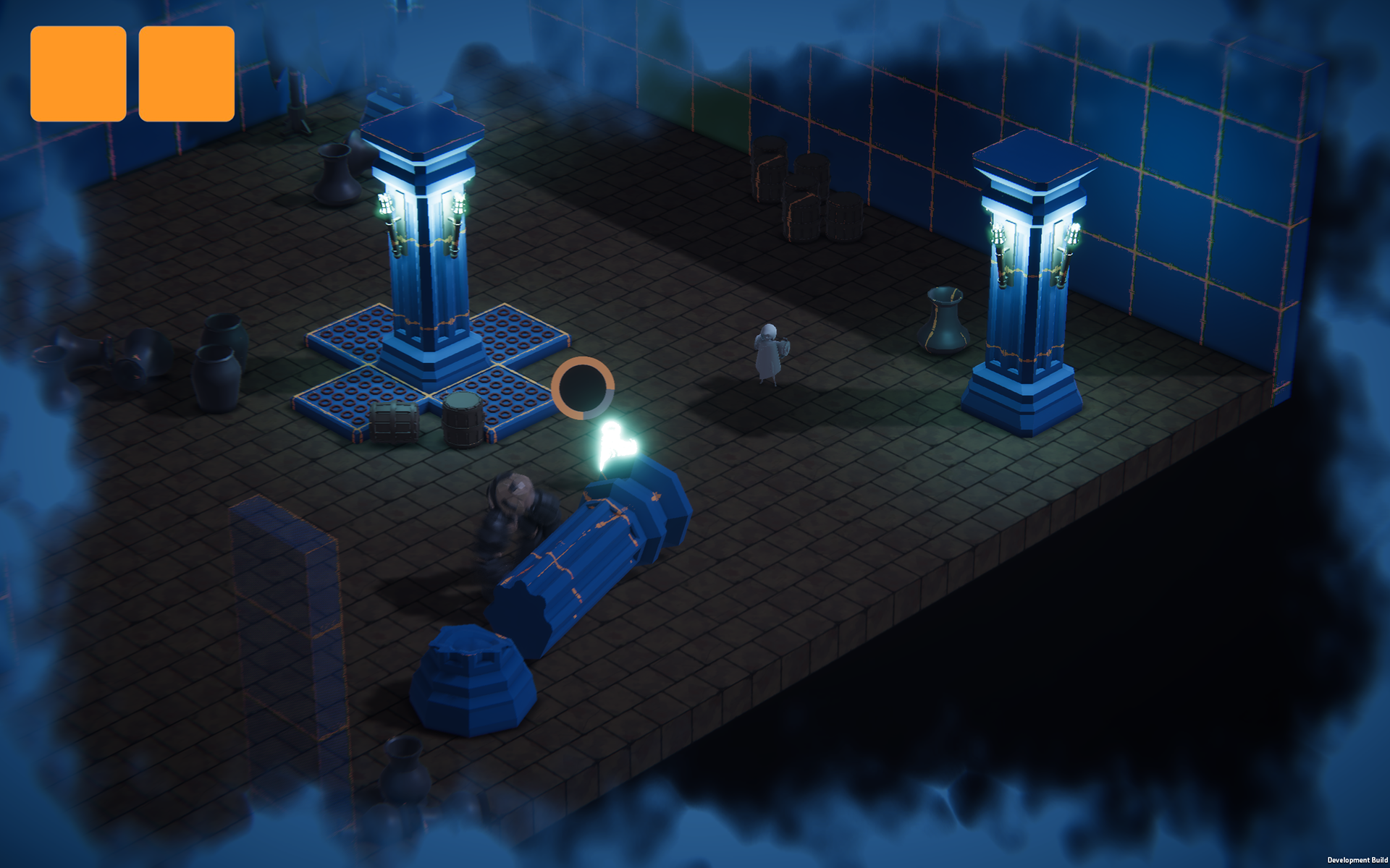
Some elements are deliberately brighter or more saturated than their surroundings so they remain immediately recognizable during combat.
Rather than blending seamlessly into the environment, gameplay-critical objects are designed to stand out first and appear natural second.
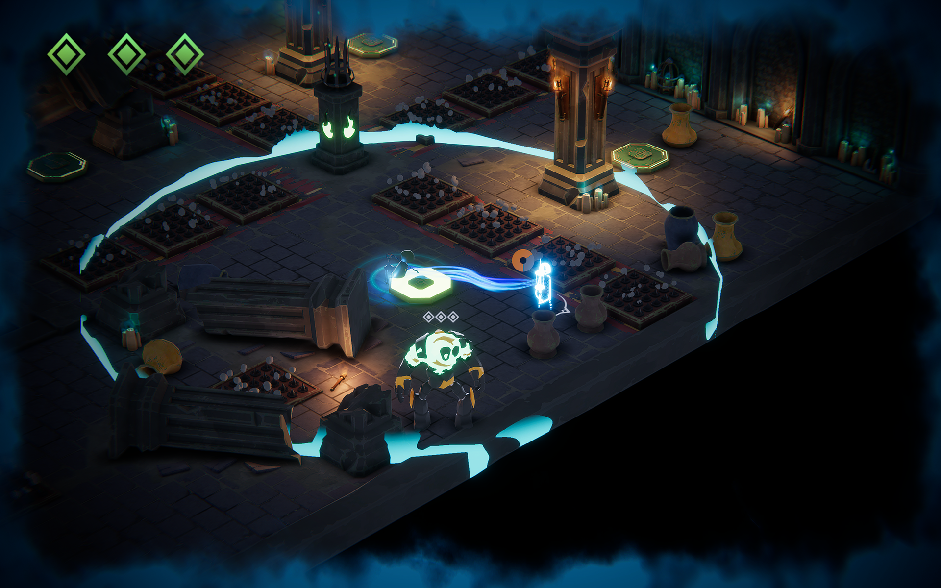
Gameplay elements intentionally break environmental consistency to remain visually dominant
Threat Readability
Players Failed to Notice Threats Before They Attacked
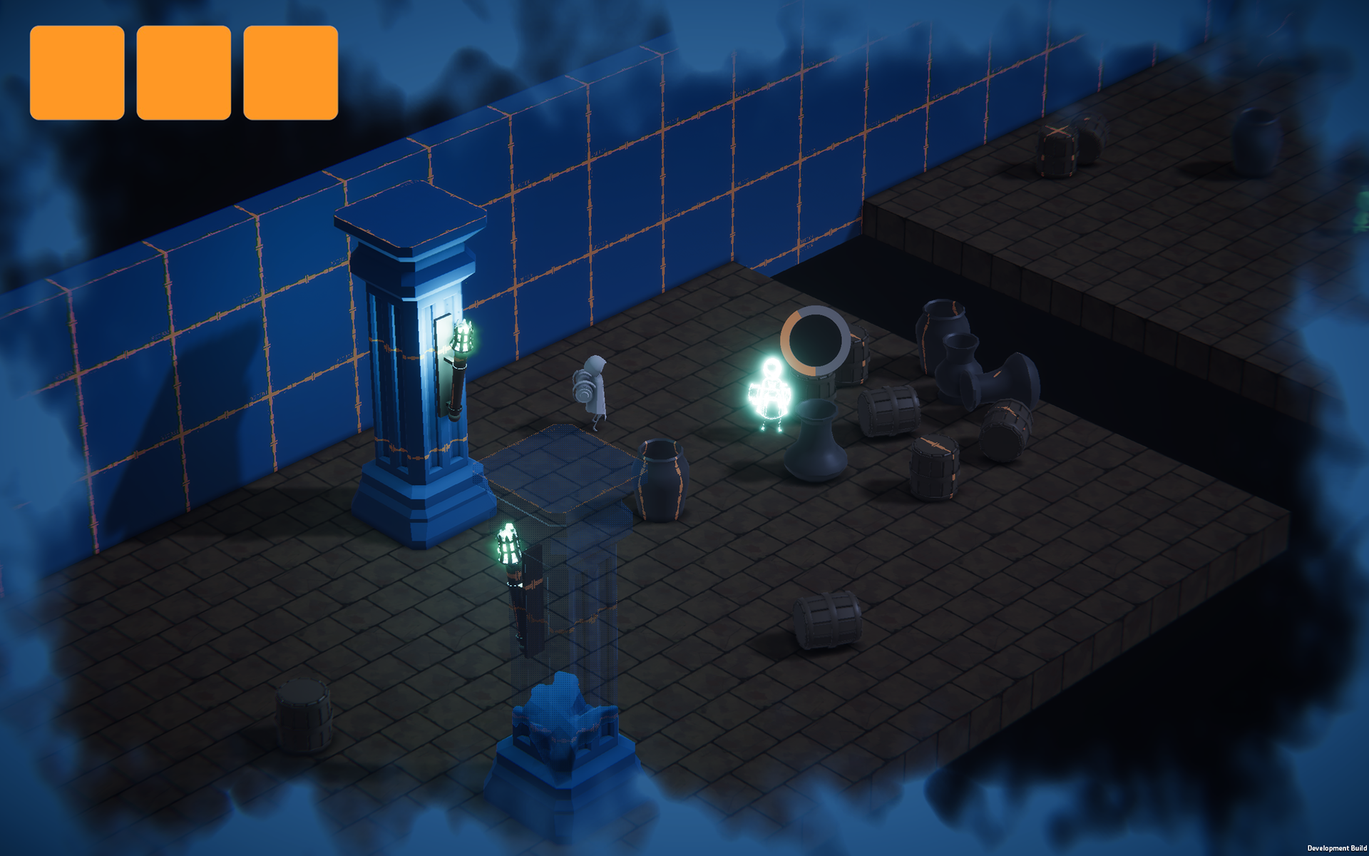
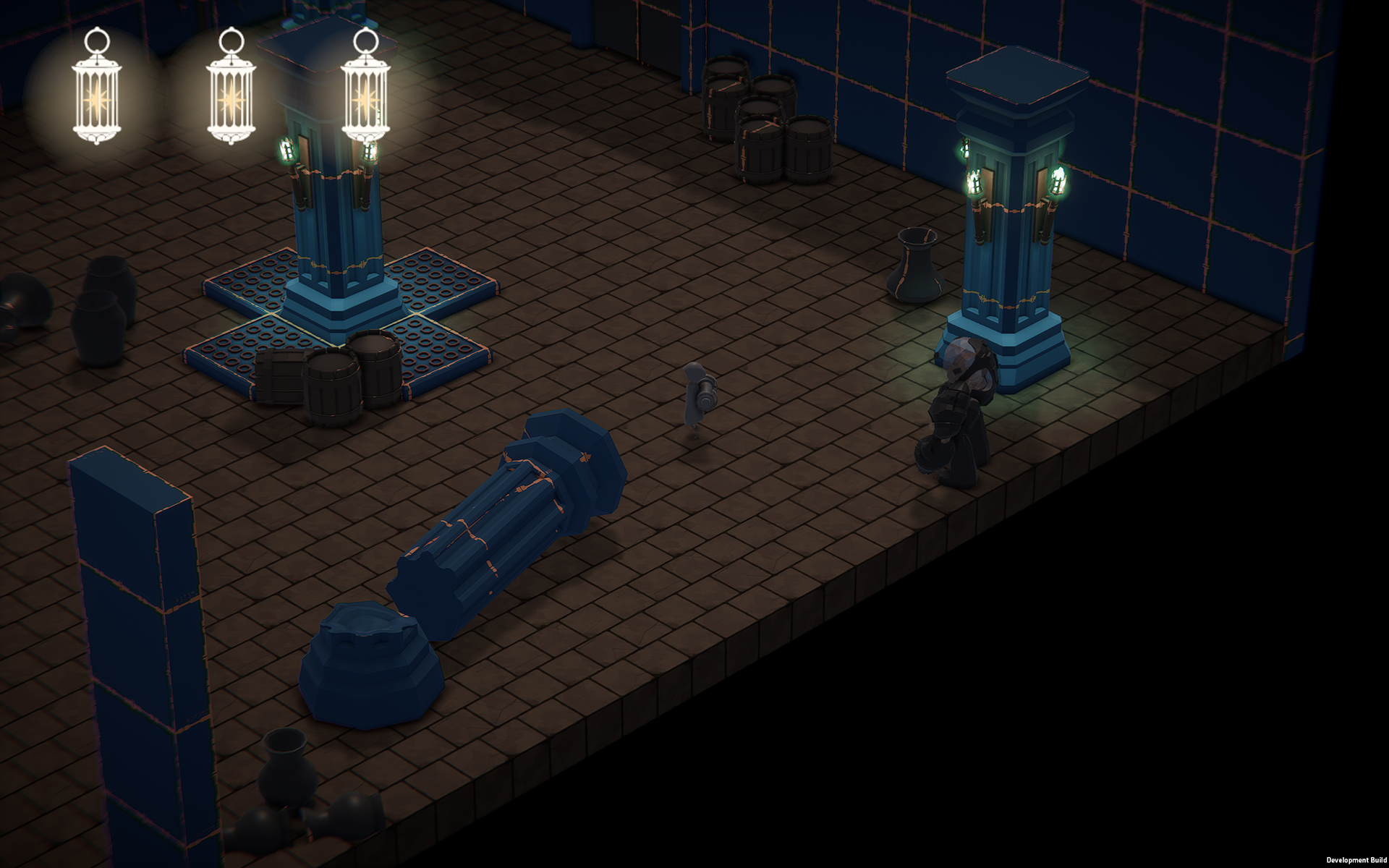
Playtesting revealed that players frequently overlooked certain enemies, particularly fast moving ones.
Two issues contributed to this problem:
▪︎ Small enemies lacked sufficient visual presence.
▪︎ Enemy lighting shared a similar warm color with the player's lantern, causing attention to be drawn toward the wrong object.
Design Decision
To improve threat recognition, enemy lighting was redesigned to establish a stronger visual hierarchy.
Key changes included:
▪︎ Increasing visibility in low light environments.
▪︎ Replacing warm orange highlights with a distinct green glow.
▪︎ Creating stronger contrast against the player's blue visual language.
Design Principle
Players should sense danger before identifying enemies
Threat recognition should occur before conscious identification.
Rather than requiring players to actively search for enemies, visual hierarchy should instinctively communicate danger through color, contrast, and lighting.
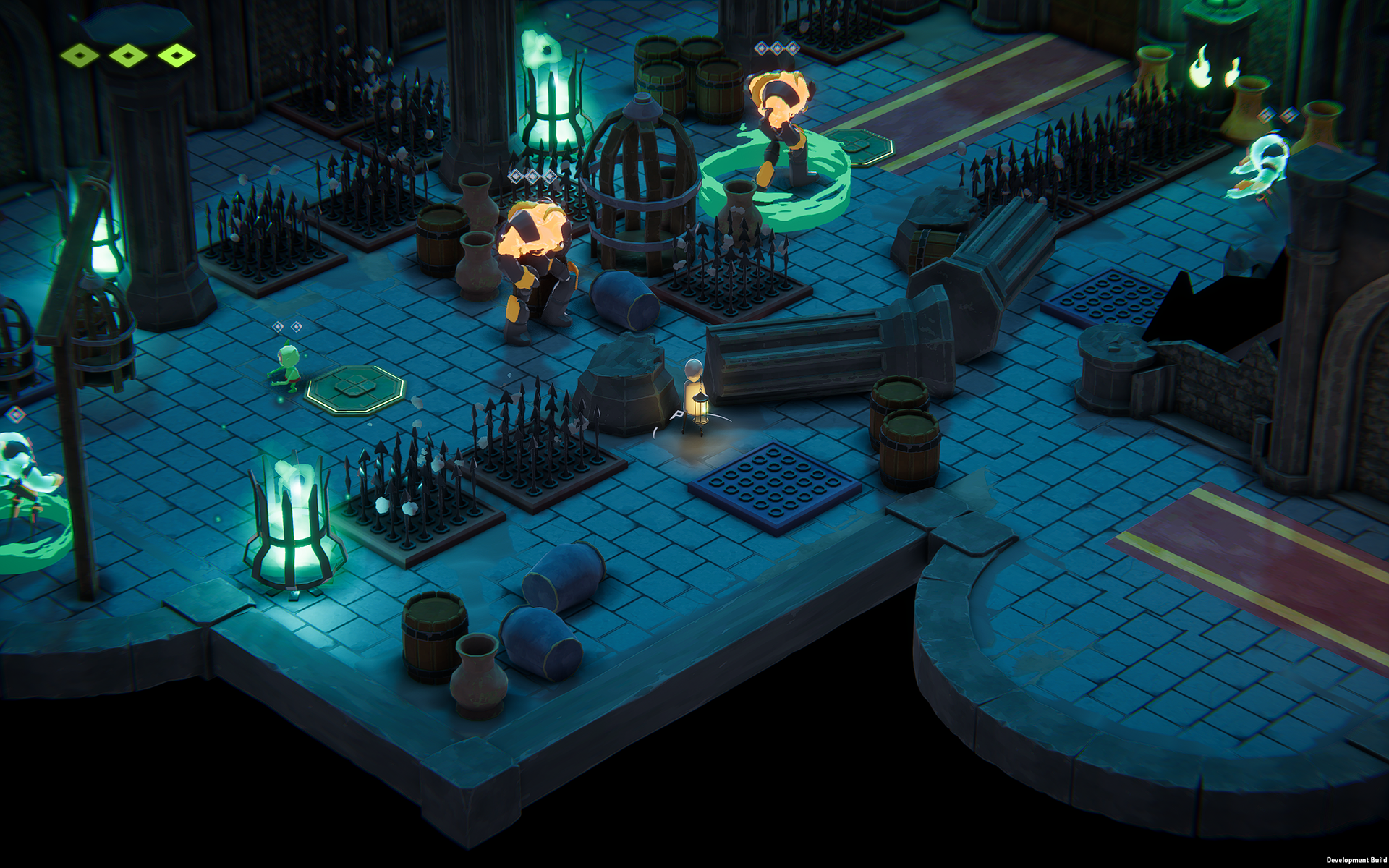
Playtesting screenshot. Players frequently overlooked nearby enemies because they blended into the environment and competed with the player's lantern for visual attention.
Information Hierarchy
Prioritizing Information Without Interrupting Gameplay
During combat, players need to process multiple pieces of information simultaneously.
If every piece of information competes for the same level of attention, the screen quickly becomes visually overwhelming.
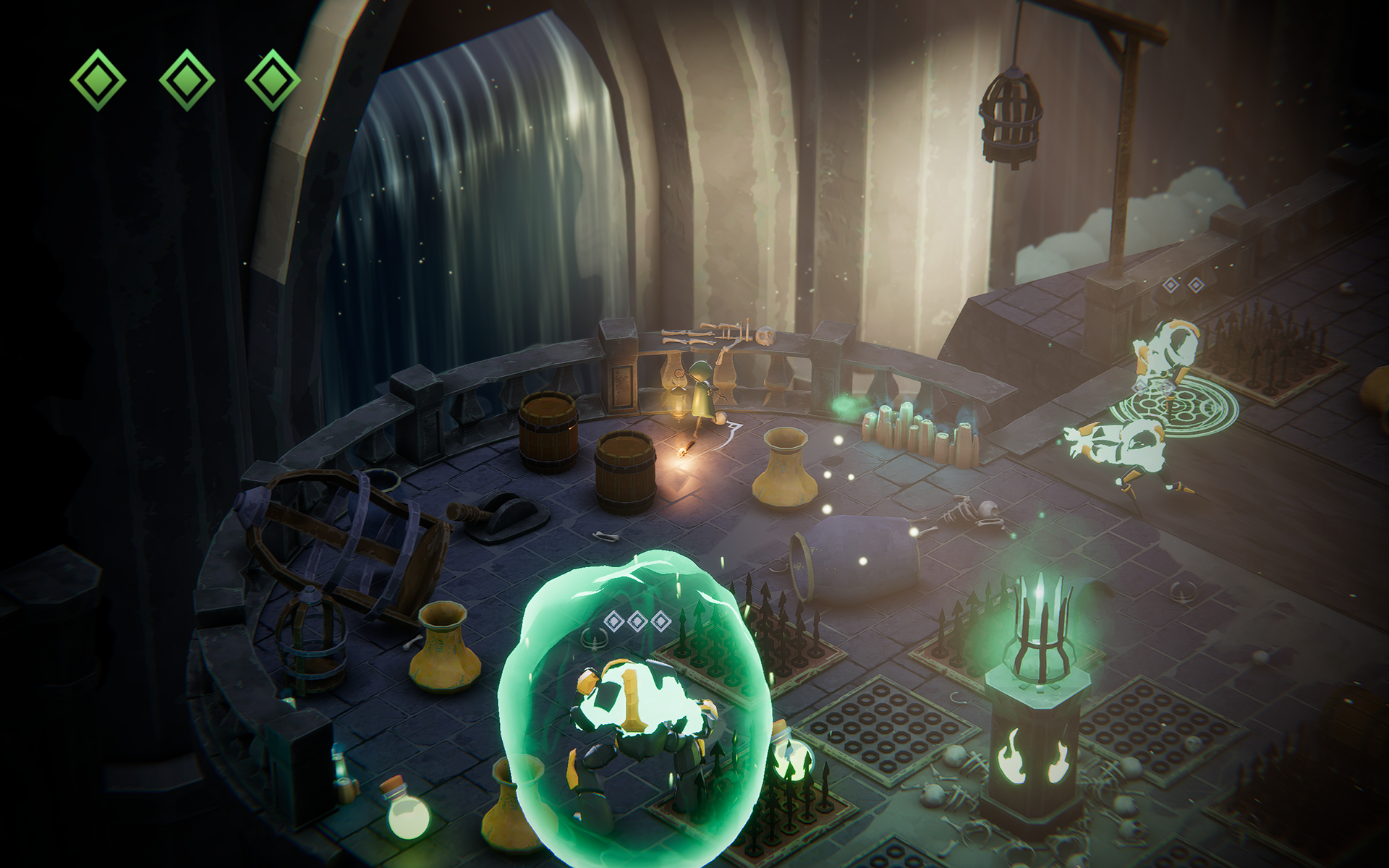
To reduce cognitive load, I organized gameplay information into two distinct layers based on how urgently players needed to perceive it.
Information Hierarchy
Primary Information
Primary information represents elements that require continuous attention throughout gameplay.
Player Health was designed to remain highly visible by:
▪︎ Maintaining a fixed position in the upper-left corner.
▪︎ Using strong contrast with bright green diamond indicators.
▪︎ Remaining immediately recognizable at any moment.
Secondary Information
Secondary information is only relevant when players intentionally focus on a specific target.
Enemy Health was therefore designed to be less visually dominant by:
▪︎ Appearing only above enemies.
▪︎ Using lower contrast with gray diamond indicators.
▪︎ Remaining noticeable without competing with primary gameplay information.
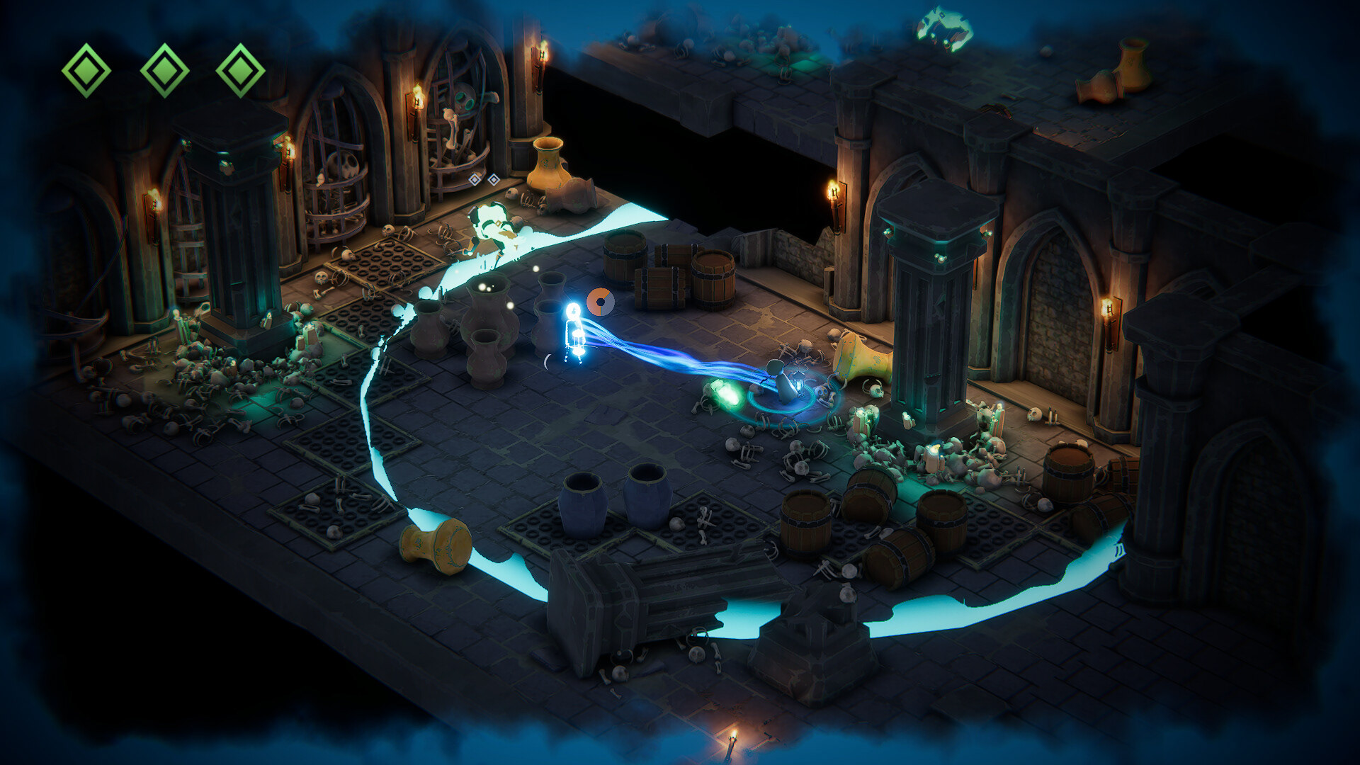
Impact
Design Outcome
The redesign transformed a collection of independent UI solutions into a unified visual communication system.
By coordinating color, lighting, visual hierarchy, and environmental cues, players were able to interpret gameplay naturally without relying on tutorials or excessive interface elements.
The final experience improved:
▪︎ Threat recognition during combat.
▪︎ Player orientation and spatial awareness.
▪︎ Information prioritization.
▪︎ Intuitive understanding of gameplay mechanics.
Core Design Principle
Players should see the right information at the right time.
Every visual decision, from lighting and color to UI hierarchy and environmental effects, was designed to reduce cognitive load and guide player attention toward what mattered most.
My Contribution
As the project's visual designer, I was responsible for establishing the visual communication system across the entire game.
My responsibilities included:
▪︎ Character modeling and animation.
▪︎ Designing the overall visual language and color system.
▪︎ Defining gameplay information hierarchy.
▪︎ Developing attention guiding visual cues.
▪︎ Integrating environment art, lighting, UI, and gameplay feedback into a unified player experience.
Rather than treating UI, VFX, lighting, and environment art as separate disciplines, I coordinated them as a single system that supported the same UX goals.